原文链接:http://www.tuicool.com/articles/FRbiYf
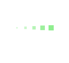
第一种效果:

代码如下:
<div class="loading">
  <span></span>
  <span></span>
  <span></span>
  <span></span>
  <span></span>
</div>
     .loading{
  width: 80px;
  height: 40px;
  margin: 0 auto;
  margin-top:100px;
}
.loading span{
  display: inline-block;
  width: 8px;
  height: 100%;
  border-radius: 4px;
  background: lightgreen;
  -webkit-animation: load 1.04s ease infinite;
}
@-webkit-keyframes load{
  0%,100%{
    height: 40px;
    background: lightgreen;
  }
  50%{
    height: 60px;
    margin-top: -20px;
    background: lightblue;
  }
}
.loading span:nth-child(2){
  -webkit-animation-delay:0.13s;
}
.loading span:nth-child(3){
  -webkit-animation-delay:0.26s;
}
.loading span:nth-child(4){
  -webkit-animation-delay:0.39s;
}
.loading span:nth-child(5){
  -webkit-animation-delay:0.52s;
}
第二种效果:

代码如下:
<div class="loading">
        <span></span>
</div>
.loading{
  width: 80px;
  height: 80px;
  border-radius: 50%;
  margin: 0 auto;
  margin-top:100px;
  position: relative;
  border:5px solid lightgreen;
  -webkit-animation: turn 2s linear infinite;
}
.loading span{
  display: inline-block;
  width: 30px;
  height: 30px;
  border-radius: 50%;
  background: lightgreen;
  position: absolute;
  left: 50%;
  margin-top: -15px;
  margin-left: -15px;
  -webkit-animation: changeBgColor 2s linear infinite;
}
@-webkit-keyframes changeBgColor{
  0%{
    background: lightgreen;
  }
  100%{
    background: lightblue;
  }
}
@-webkit-keyframes turn{
  0%{
    -webkit-transform: rotate(0deg);
    border-color: lightgreen;
  }
  100%{
    -webkit-transform: rotate(360deg);
    border-color: lightblue;
  }
}
第三种效果:
代码如下:
<div class="loading">
  <span></span>
  <span></span>
  <span></span>
  <span></span>
  <span></span>
</div>
.loading{
  width: 150px;
  height: 15px;
  margin: 0 auto;
  margin-top:100px;
  text-align: center;
}
.loading span{
  display: inline-block;
  width: 15px;
  height: 100%;
  margin-right: 5px;
  background: lightgreen;
  -webkit-animation: load 1.04s ease infinite;
}
.loading span:last-child{
  margin-right: 0px;
}
@-webkit-keyframes load{
  0%{
    opacity: 1;
    -webkit-transform: scale(1.2);
  }
  100%{
    opacity: .2;
    -webkit-transform: scale(.2);
  }
}
.loading span:nth-child(1){
  -webkit-animation-delay:0.13s;
}
.loading span:nth-child(2){
  -webkit-animation-delay:0.26s;
}
.loading span:nth-child(3){
  -webkit-animation-delay:0.39s;
}
.loading span:nth-child(4){
  -webkit-animation-delay:0.52s;
}
.loading span:nth-child(5){
  -webkit-animation-delay:0.65s;
}
第四种效果:

代码如下:
<div class="loading">
        <span></span>
</div>
.loading{
  width: 150px;
  height: 8px;
  border-radius: 4px;
  margin: 0 auto;
  margin-top:100px;
  position: relative;
  background: lightblue;
  overflow: hidden;
}
.loading span{
  display:block;
  width: 100%;
  height: 100%;
  border-radius: 3px;
  background: lightgreen;
  -webkit-animation: changePosition 4s linear infinite;
}
@-webkit-keyframes changePosition{
  0%{
    -webkit-transform: translate(-150px);
  }
  50%{
    -webkit-transform: translate(0);
  }
  100%{
    -webkit-transform: translate(150px);
  }
}
第五种效果:
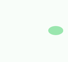
代码如下:
<div class="loading">
        <span></span>
</div>
.loading{
  width: 200px;
  height: 60px;
  margin: 0 auto;
  margin-top: 100px;
  position: relative;
}
.loading span{
  width: 50px;
  height: 30px;
  border-radius: 50%;
  background: lightgreen;
  position: absolute;
  top: 50%;
  margin-top: -15px;
  overflow: hidden;
  -webkit-animation: changePosition 2.08s linear infinite;
}
@-webkit-keyframes changePosition{
  0%,100%{
    -webkit-transform: translate(70px);
  }
  20%{
    width: 50px;
    height: 30px;
    margin-top:-15px;
    -webkit-transform: translate(0px);
  }
  30%{
    width: 20px;
    height: 60px;
    margin-top:-30px;
    -webkit-transform: translate(0px);
  }
  35%{
    width: 50px;
    height: 30px;
    margin-top:-15px;
    -webkit-transform: translate(5px);
    background: lightblue;
  }
  70%{
    width: 50px;
    height: 30px;
    margin-top:-15px;
    -webkit-transform: translate(160px);
  }
  80%{
    width: 20px;
    height: 60px;
    margin-top:-30px;
    -webkit-transform: translate(160px);
  }
  85%{
    width: 50px;
    height: 30px;
    margin-top:-15px;
    -webkit-transform: translate(155px);
    background: lightgreen;
  }
}
第六种效果:

代码如下:
<div class="loadEffect">
  <span></span>
  <span></span>
  <span></span>
  <span></span>
  <span></span>
  <span></span>
  <span></span>
  <span></span>
</div>
.loadEffect{
  width: 100px;
  height: 100px;
  position: relative;
  margin: 0 auto;
  margin-top:100px;
}
.loadEffect span{
  display: inline-block;
  width: 30px;
  height: 10px;
  border-top-left-radius: 5px;
  border-bottom-left-radius: 5px;
  background: lightgreen;
  position: absolute;
  -webkit-animation: load 1.04s ease infinite;
}
@-webkit-keyframes load{
  0%{
    opacity: 1;
  }
  100%{
    opacity: 0.2;
  }
}
.loadEffect span:nth-child(1){
  left: 0;
  top: 50%;
  margin-top:-5px;
  -webkit-animation-delay:0.13s;
}
.loadEffect span:nth-child(2){
  left: 10px;
  top: 20px;
  -webkit-transform: rotate(45deg);
  -webkit-animation-delay:0.26s;
}
.loadEffect span:nth-child(3){
  left: 50%;
  top: 10px;
  margin-left: -15px;
  -webkit-transform: rotate(90deg);
  -webkit-animation-delay:0.39s;
}
.loadEffect span:nth-child(4){
  top: 20px;
  right:10px;
  -webkit-transform: rotate(135deg);
  -webkit-animation-delay:0.52s;
}
.loadEffect span:nth-child(5){
  right: 0;
  top: 50%;
  margin-top:-5px;
  -webkit-transform: rotate(180deg);
  -webkit-animation-delay:0.65s;
}
.loadEffect span:nth-child(6){
  right: 10px;
  bottom:20px;
  -webkit-transform: rotate(225deg);
  -webkit-animation-delay:0.78s;
}
.loadEffect span:nth-child(7){
  bottom: 10px;
  left: 50%;
  margin-left: -15px;
  -webkit-transform: rotate(270deg);
  -webkit-animation-delay:0.91s;
}
.loadEffect span:nth-child(8){
  bottom: 20px;
  left: 10px;
  -webkit-transform: rotate(315deg);
  -webkit-animation-delay:1.04s;
}
第七种效果:
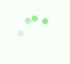
代码如下:
<div class="loadEffect">
        <div><span></span></div>
        <div><span></span></div>
        <div><span></span></div>
        <div><span></span></div>
</div>
.loadEffect {
  width: 100px;
  height: 100px;
  margin: 0 auto;
  margin-top:100px;
  position: relative;
}
.loadEffect div{
  width: 100%;
  height: 100%;
  position: absolute;
  -webkit-animation: load 2.08s linear infinite;
}
.loadEffect div span{
  display: inline-block;
  width: 20px;
  height: 20px;
  border-radius: 50%;
  background: lightgreen;
  position: absolute;
  left: 50%;
  margin-top: -10px;
  margin-left: -10px;
}
@-webkit-keyframes load{
  0%{
    -webkit-transform: rotate(0deg);
  }
  10%{
    -webkit-transform: rotate(45deg);
  }
  50%{
    opacity: 1;
    -webkit-transform: rotate(160deg);
  }
  62%{
    opacity: 0;
  }
  65%{
    opacity: 0;
    -webkit-transform: rotate(200deg);
  }
  90%{
    -webkit-transform: rotate(340deg);
  }
  100%{
    -webkit-transform: rotate(360deg);
  }
}
.loadEffect div:nth-child(1){
  -webkit-animation-delay:0.2s;
}
.loadEffect div:nth-child(2){
  -webkit-animation-delay:0.4s;
}
.loadEffect div:nth-child(3){
  -webkit-animation-delay:0.6s;
}
.loadEffect div:nth-child(4){
  -webkit-animation-delay:0.8s;
}
第八种效果:

代码如下:
<div class="loading">
        <div><span></span></div>
        <div><span></span></div>
        <div><span></span></div>
</div>
.loading{
  width: 60px;
  height: 60px;
  margin: 0 auto;
  margin-top:100px;
  position: relative;
  -webkit-animation: load 3s linear infinite;
}
.loading div{
  width: 100%;
  height: 100%;
  position: absolute;
}
.loading span{
  display: inline-block;
  width: 20px;
  height: 20px;
  border-radius: 50%;
  background: #99CC66;
  position: absolute;
  left: 50%;
  margin-top: -10px;
  margin-left: -10px;
  -webkit-animation: changeBgColor 3s ease infinite;
}
@-webkit-keyframes load{
  0%{
    -webkit-transform: rotate(0deg);
  }
  33.3%{
    -webkit-transform: rotate(120deg);
  }
  66.6%{
    -webkit-transform: rotate(240deg);
  }
  100%{
    -webkit-transform: rotate(360deg);
  }
}
@-webkit-keyframes changeBgColor{
  0%,100%{
    background: #99CC66;
  }
  33.3%{
    background: #FFFF66;
  }
  66.6%{
    background: #FF6666;
  }
}
.loading div:nth-child(2){
  -webkit-transform: rotate(120deg);
}
.loading div:nth-child(3){
  -webkit-transform: rotate(240deg);
}
.loading div:nth-child(2) span{
  -webkit-animation-delay: 1s;
}
.loading div:nth-child(3) span{
  -webkit-animation-delay: 2s;
}
